
Sunday, June 7, 2009
Tuesday, October 21, 2008
ARCH1142 - Architectural Drawing
Initially when I planned to do the drawing workshop my reasoning was that it'd probably be about technical drawing which would help with my engineering. But to my surprise, I found myself really enjoying this workshop.


Here are the teaching drawings.
the cup.  the cup that its drawn from.
the cup that its drawn from. the perspective.
the shading exercise.
the mock-ups in chronological order.
The final drawing - what inspired it, the process
The inspiration.
Draft stuff. Again, in chronological order.
The final version. The two photos are meant to be linked but my camera wasnt able to fit both on the same photo without distorting the quality to a damaging extent as I did both on A1. Though my camera IS rather awful...
I had thought that it was an oral presentation for our drawings. Even then, I really should have printed out my inspiration because my translation of it was a bit too abstract and simplistic for such a lush photo. As for the drawing itself, I definitely should have continued the asometric theme for the plans on to the second sheet. I tried, but the sheets were too big and it just didnt line up properly so I approximated. Now the first sheet looks perfectly planned but the second one looks just a bit off even though what I wanted to express still comes through.
I don't regret my final presentation though and the idea to trace leaves was a great idea in my estimation. It captured the autumn feel I was going for with real leaves. The mountains might look better in a more western abstract instead of the asian one but I don't thing it would've made too much of a difference. What would have made a big difference is if i remembered to bring my charcoal. Had to run to the quad store in a last minute effort for charcoal and got this thing that didn't really smudge properly.
Overall, I think that my presentation drawing did work well.
Monday, September 22, 2008
ARCH1142 - Atlas of Colour 3
Before anything else, I'll upload the work done between last entry and this one. The atlas is done, so they're the final versions unlike the previous blog entry.


I don't think I'll upload the rest, there's nothing I'm particularly proud or ashamed of and everything afterall, is in the atlas. Also, the colours are not the best so I don't particularly want the rest of my atlas to be forever enshrined on the internet in colours their creator did not intend.
the tonal keys - which i actually forgot to print and include in my journal. A fact that I forgot about until I was cleaning out my folder yesterday...

the facemap - despite the wacky names (I was REALLY out of it when I did it), I really like the facemap. It was a lot of fun. The colour is a blogspor thing I think but yeah, its not suppose to look like something in accordance with Corey Worthington's fashion sense.
As a foreword, I didn't particularly get what I was supposed to do with the collage until the last minute. So especially the plan was not particularly detailed. But I have to say, the elevation's pretty much my best work in this atlas. I like the plan too layering the same street over and over has an unexpected effect that is quite good. Once again, the colours aren't supposed to be like that, blogspot is a bit weird. Though maybe it'll look better when its published. Just a note, the orange bits are supposed to be BLUE.

I don't think I'll upload the rest, there's nothing I'm particularly proud or ashamed of and everything afterall, is in the atlas. Also, the colours are not the best so I don't particularly want the rest of my atlas to be forever enshrined on the internet in colours their creator did not intend.
For my atlas, I probably should've put more thought into it than I did. The esquisse definitely should've been better but the main colour components (i.e. above elevation) I thought I did fairly well.
At the conclusion of this workshop, I honestly can't recommend this workshop for anyone who thought BENV1080 a waste of time. Because this workshop, aside from the fact that we actually did learn something about colour theory - something that in the end wasn't included in the atlas, was exactly like BENV1080. Ok, it is marginally more interesting but not by much.
Tuesday, September 2, 2008
ARCH1142 - Atlas of Colour 2
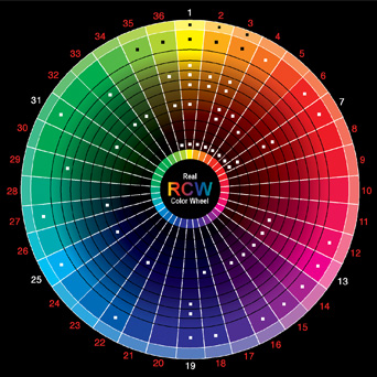
Here are the two pieces of work I've done so far for this workshop. The colours are not what they should be, but all shall be revealed in the final atlas.

I actually did most of the colour wheel in Paint and then morphed it in Photoshop.


I actually did most of the colour wheel in Paint and then morphed it in Photoshop.

Tuesday, August 26, 2008
ARCH1142 - Atlas of Colour 1
Before doing this workshop, I never realised how important colour is to architecture. The commonly revered architectural styles are classical, such as the Greco Roman style where white is predominant as the colour of choice inside and out. Where whatever colour there is will be in the interior and is added by the furnishings as opposed to part of the design archtecturally. Of course, at the time paint hasn't been invented and dyed clothing was a symbol of wealth so coloured architecture wasn't all that possible. Though if you study Chinese architecture buildings no matter how old are usually painted in white(painted as oppose to natural white), red, green and yellow. And for the imperial family, purple and gold. However, the colour scheme is less architectural and more cultural, so in all honesty, it can't be labelled a conscious architectural decision. So until the 20th century colour hasn't been a big part of architecture.
Now, with the advent of colour theory, colour has become a larger part of commercial architecture. With red becoming the predominant colour of choice for any fast food place or broken hues and dark blues for banks to denote respectability.
Now, with the advent of colour theory, colour has become a larger part of commercial architecture. With red becoming the predominant colour of choice for any fast food place or broken hues and dark blues for banks to denote respectability.
I'd have to do a collage version of the above some time in the next week. Thing is, I'm not too great with well, creating things.
Monday, August 25, 2008
ARCH1142 - Architecture in Motion
For my first workshop this session - architecture in motion, I made a short stop motion film. Though 'short' is debatable as the film had to be 'longer than 20 seconds', and my film (along with most people in my tut) was considerably longer than that.
Reflecting back on this workshop (as I had no idea what to write in this blog before being enlightened today - I'm one of the engineering students, I need instructions!) despite the painful amount of work we had to do, it was really really fun. I can't deny that it is hardwork.
For the progression marks be to good, everyone in this workshop pretty much have to cobble together a complete stop motion film in three weeks despite the fact that most of us haven't even heard of stop motion film before this. I mean, we've all seen stop motion films, but very few of us were aware that they are 'stop motion films'. And I think only one or two people in the workshop has ever made one before. Not to mention the insane amount of content we had to put into the film while grappling with the concept of a 'spatial narrative'.
I was one of the people who were guilty of creating a plot driven narrative as opposed to a spatial one, but thing is, we were really given feed back on the difference between the two until week 3, when I had already made most of my film. At that point, the only choice is to go on with what I already have.
The thing I really should have done when the feed back came back in week 3 was to push more drawing components in. At the time I had two transitions that I haven't yet finalized so I could've easily made both drawing components. In my defence I did try, but it really wasn't enough.
Now I have gotten most of the angst about my film out (though I'm quite happy with my final mark), I'm going to confess something. The William Kentridge research was really really annoying. Purely because at the beginning of the workshop most of us (or at least the people I talked to) thought the Kentridge research was a 'suggestion'. i.e. er, we really didnt have to do it. So when Meeray said that we were supposed to relate our film to Kentridge it was kind of a 'ok, we probably should've be told about this earlier...' moment. Since probably aside from Scott who did a Kentridge inspired film because he did something similar in high school, the rest of us had to be really 'creative' when doing the Kentridge research.
Though, I probably said this before, I really did like this particular workshop as I have learnt so much from making this film. The first one probably have to be what a stop motion film is. The other major one is that I'm really not cut out to be a photographer. Though as my digital camera died a while back and this assignment was entirely done using my mobile phone, the pictures weren't as bad as it could've been.
The last is light. Light, I have discovered, is EVERYTHING. I won't bore you with the details, but finding a place where i can photograph my stills without weird light effects was such a pain. And natural daylight works the best. Nothing really beat natural light. Once its dark, photographing something on a flat surface is just painful. Also, the spatial component in my film is heavily based on how light interacts with a space. It dictates the mood of a room, allows for a sense of time and when the light moves, your eyes are subconsciously drawn to follow it.
Some minor points include my discovery that a little clay can go a LONG way. Though play-doh may be cheaper (I wouldn't know, have never bought any in recent memory), clay PRODUCES. I used about a fifth of my pitifully small and horrifically expensive lump of clay to create all the modelling effects in my film.
Oh yes, and that charcoal sticks can produce some really amazing things when used properly. Though beware smudging. A good way that I found was to wrap the charcoal in a piece of tissue paper or some plastic.
Now at the end of my one and only architecture in motion blog, I would like to say, that despite all the frustrations, it had been really fun and I did learn a lot. More than an entire session of BENV1080.
I was going to upload the final version of my film but for some reason blogspot won't allow me to upload. Merray should have my film on a cd still so it should still be around FBE somewhere. I will try and upload it again tomorrow but unfortunately, I can't guarantee anything. My luck is notoriously bad with computers...
Subscribe to:
Posts (Atom)